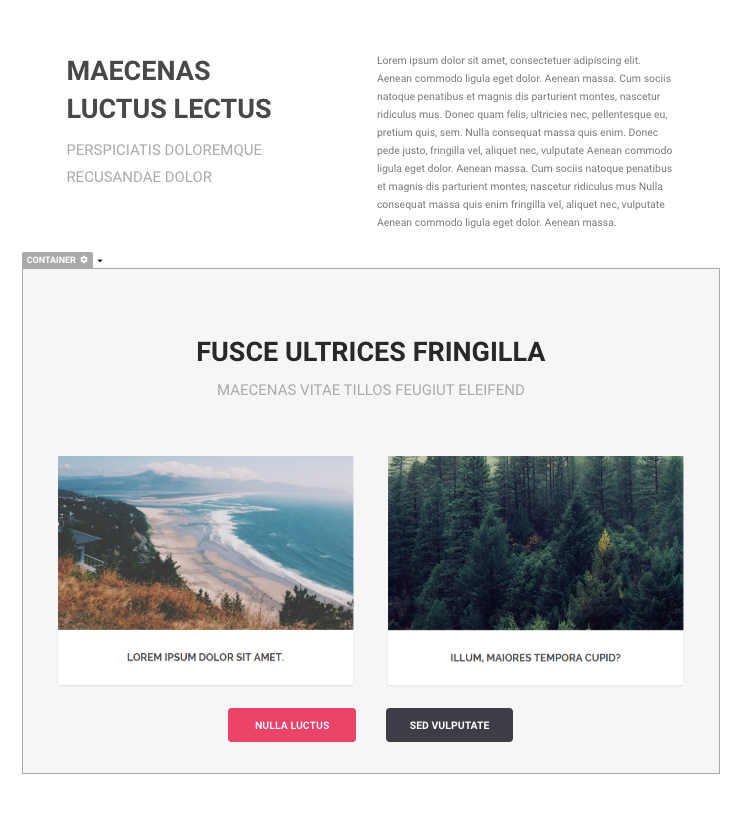
A Container is an expandable space used to house other page elements together. You can place any page element inside a container. It’s a powerful component that lets you divide page sections into grid-like layouts.
Add a Container on a Page
To add a Container,, click the Add [+] Button on the top left corner of the Page Editor to slide the web page elements menu. Then simply drag the Container element into the page you’re working on.
Add Page Elements inside a Container
To add a page element inside a Container, just drag and drop the object inside the container.
Container as Page Sections
A Container is an expandable space that can be used to house page elements and divide the page into sections.
Container for Grouping Page Objects
A Container can be used to house page objects that belong together. You can place any page element inside a container.
 Container Property Settings
Like any page element, the Container has its own property settings. You can change the following settings for Containers:
-
Background
-
Size
-
Position & Padding
-
Alignment
-
Borders & Shadow
-
Container Actions
Container Background Settings
This is a container that fills up the entire width of the page. There are 2 ways to change the background of the container:
-
Pick a Color; or
-
Upload an Image from your computer or paste it into a URL
Container Resizing Settings
You can control the width or the height of the container. To automatically adjust the height of the container when objects are added, turn on “Auto Size.”
Container Position & Padding Settings
-
Position - You can move the Container’s position upward or downward.
-
Padding - You can control the space around the objects inside the container.
Alignment Settings
You can set the alignment of the Container to the left, center, or right.
Borders & Shadow Settings
You can adjust the following border settings:
-
Border Style (solid or dashed)
-
Border Color
-
Border Thickness
-
Rounded Corners
-
Border Shadow
Container Actions
You can select an action to be triggered when the container is clicked.
-
Do Nothing
-
Go to the next page - redirect to the next page in the same funnel
-
Go to a Specific Page - redirect to a page in a campaign or redirect to a specific URL
-
Download a File
-
Show a Popup Window
-
Submit this Form
-
Purchase Items (New Card)
-
Purchase Items (One Click Upsell)
-
Toggle Add/Remove To Cart
-
Show / Hide Items - show or hide page content from the same page
-
Create / Update Tag
-
Switch Tabs - show the content from a specific tab in the same page
Other Element Options
Click the dropdown arrow next to the settings icon of the element or right-click on the element to show the other options.
-
Cut - the element will be removed from the page and can be pasted in another part of the page or on a different page
-
Copy - the element will be copied and can be pasted into another part of the page or on a different page
-
Paste Below - a copied or cut element will be pasted below the selected element
-
Rename - the element will be renamed instead of having the default element label
-
Duplicate - the element will be duplicated and placed below the selected element
-
Delete - the element will be deleted from the page
-
Container / Column Settings - it will open the settings menu on the left side of the screen
-
Help with Containers / Columns - it will open up a new tab and redirect to a help article about the element